Logo Design and Branding
A curated collection of logos and brand identities created across different industries, markets and moments in our design journey.
From bespoke typography and handcrafted lettering to contemporary identity systems, each project began with a different brief but shared the same intent - to create something distinctive, relevant and memorable. The archive brings together selected logo explorations alongside their real-world applications across packaging, merchandise, print and other brand touchpoints, offering a quick glimpse into the breadth of our branding work over the years.
-
Brand Identity
Logo Design
Visual Identity
Custom Typography
Hand Lettering
Calligraphic Identity
Identity Refresh
Brand Applications
Art Direction -
Logo & Identity Systems
Logo Variations
Brand Marks
Custom Letterforms
Stationery
Packaging
Merchandise
Signage
Print Collateral
Digital Brand Applications
Explore a curated collection of our past work, where imagination meets strategy. Each project reflects our drive to deliver thoughtful, effective solutions.

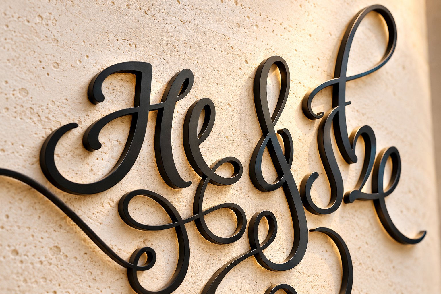
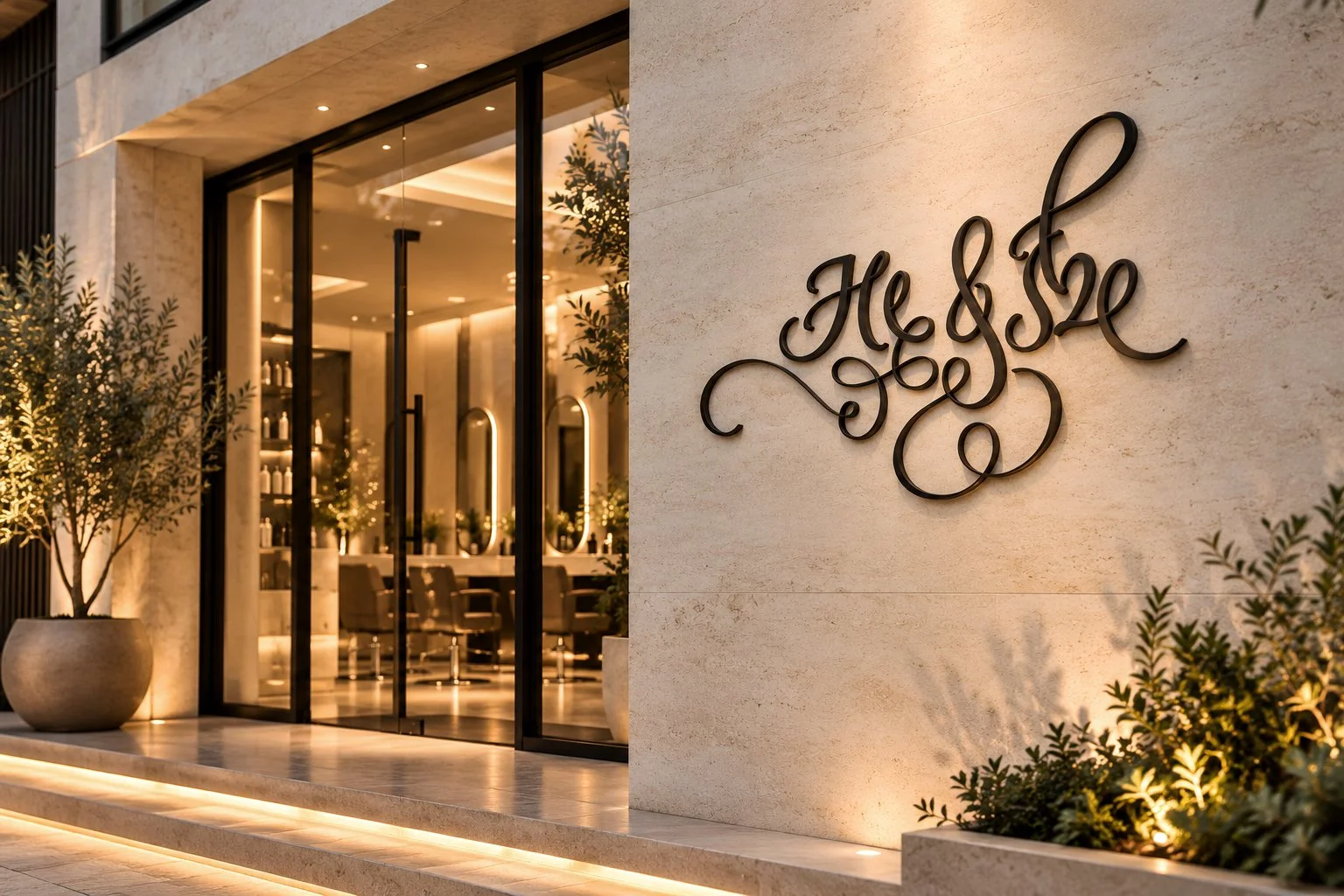
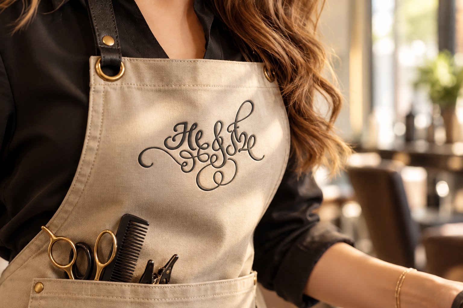
He & She - Unisex Salon
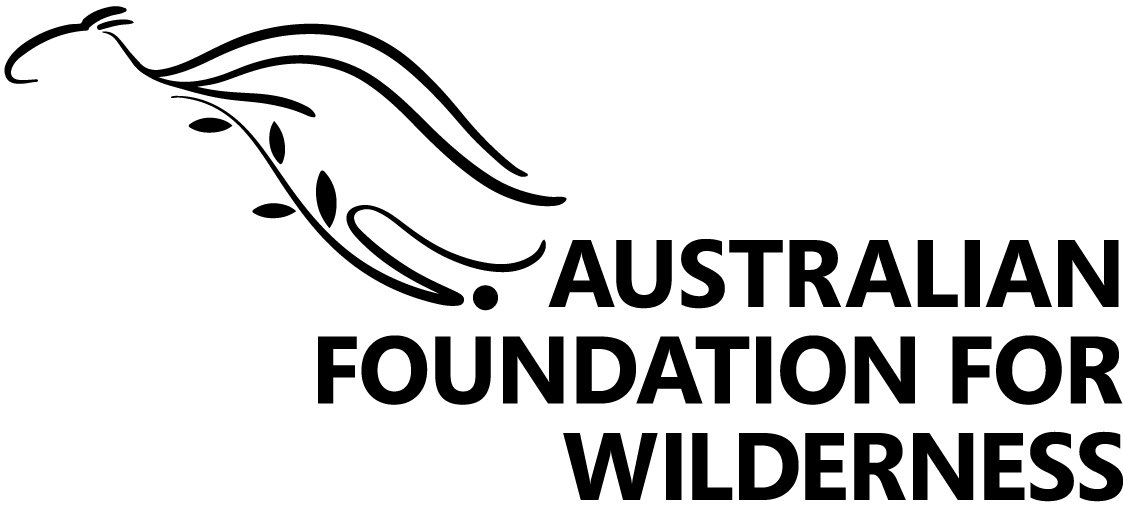
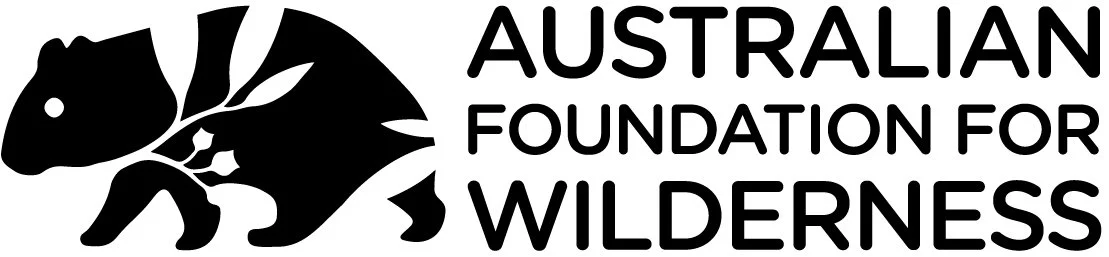
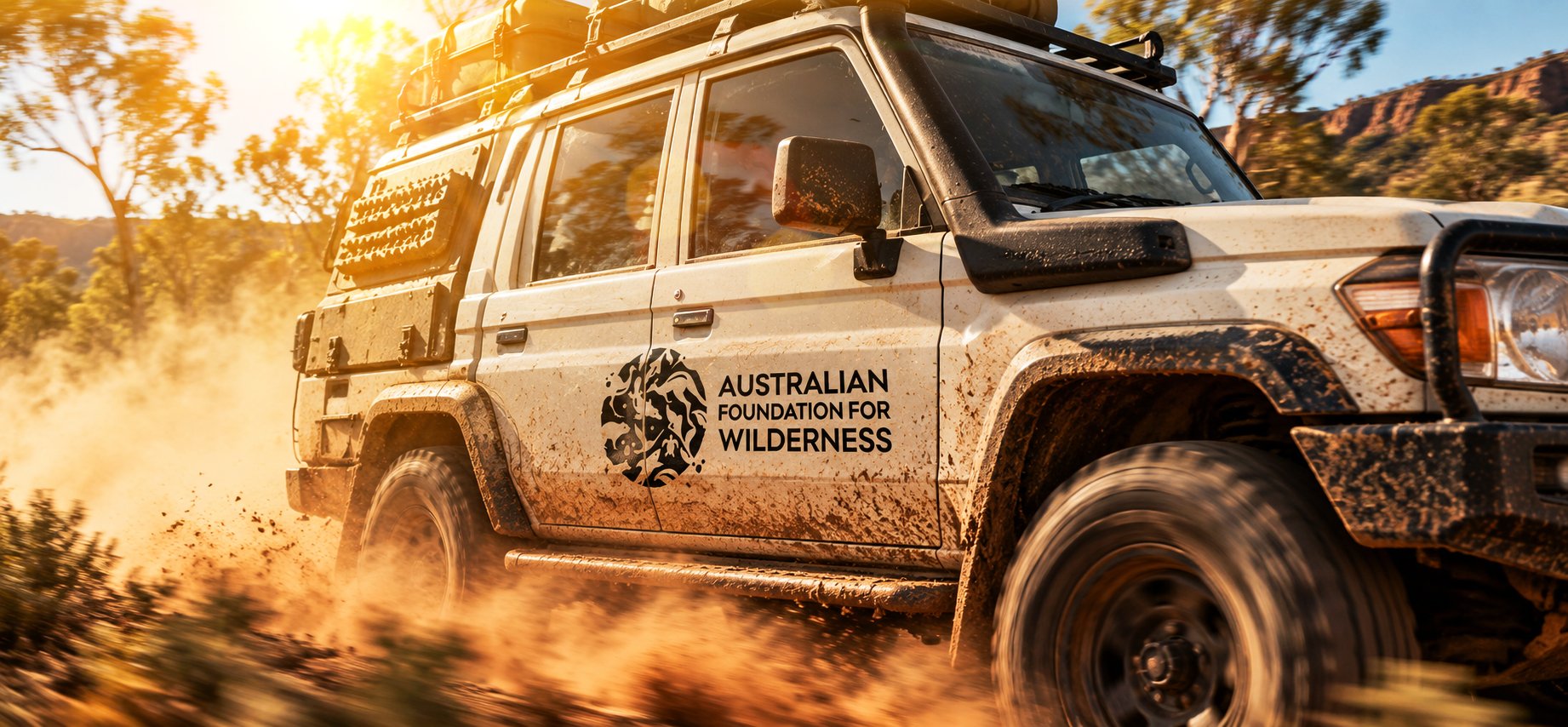
Australian Foundation of Wilderness
A new visual identity was explored for the Australian Foundation for Wilderness as the organisation evolved from a regional conservation body towards a broader national presence. The identity needed to communicate nature, wildlife and wilderness while feeling confident, contemporary and credible to both the wider community and the business world. Colong Foundation briefing shee…
The logo development explored different interpretations of Australian native wildlife, flora and natural landscapes, bringing animals and nature together through simple, distinctive graphic forms. The objective was to create an identity that felt authentic and approachable, while reflecting the organisation’s strategic, campaigning and results-driven character.

Zero with Hero
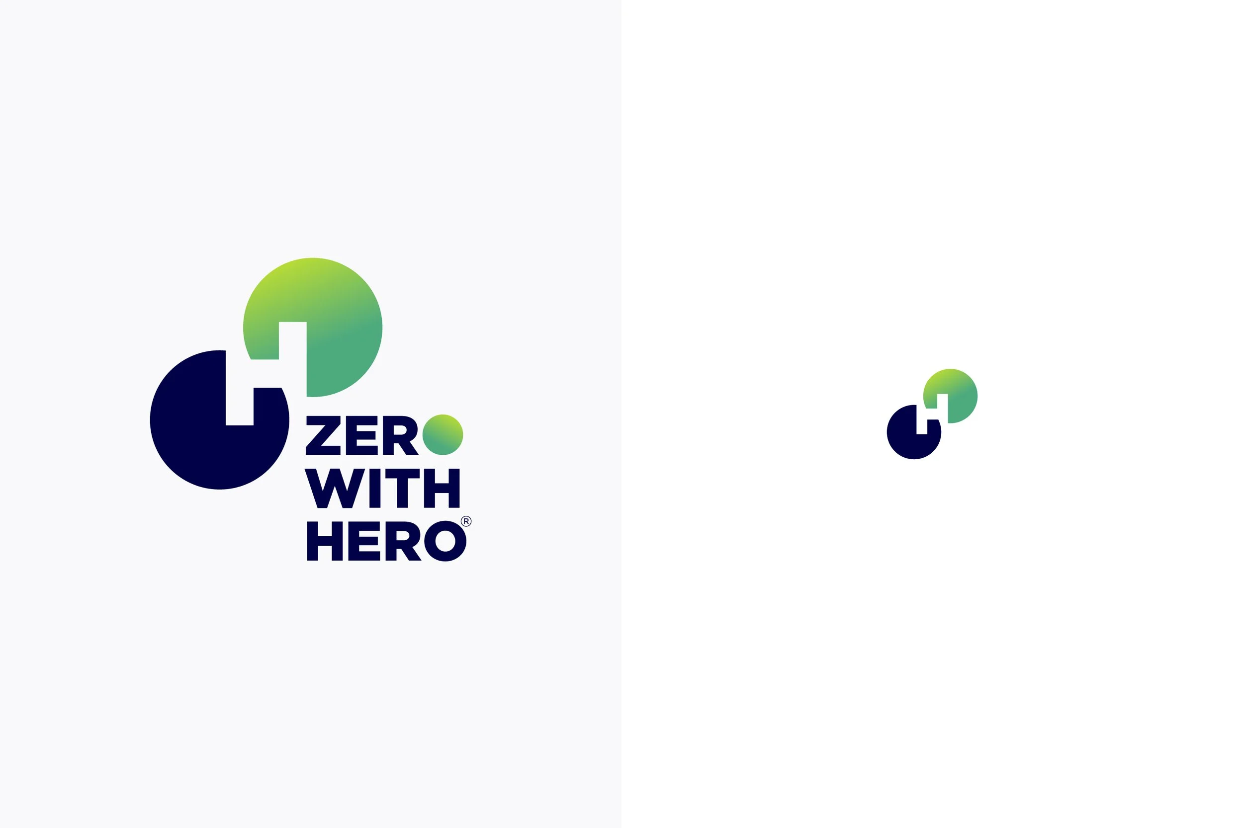
Zero with HERO® is a consumer-facing clean energy initiative developed for Star Scientific, created to communicate innovation, environmental responsibility and a future of zero-emissions energy.
The identity was designed to feel bold, modern and science-led while remaining approachable to a wider consumer audience. The logo explores a distinctive geometric symbol built around the idea of zero and HERO, using interconnected circular forms to suggest energy, connection and continuous movement. A contemporary colour palette and strong typography give the identity flexibility across digital, corporate, promotional and consumer-facing applications.
Soulful Himachal
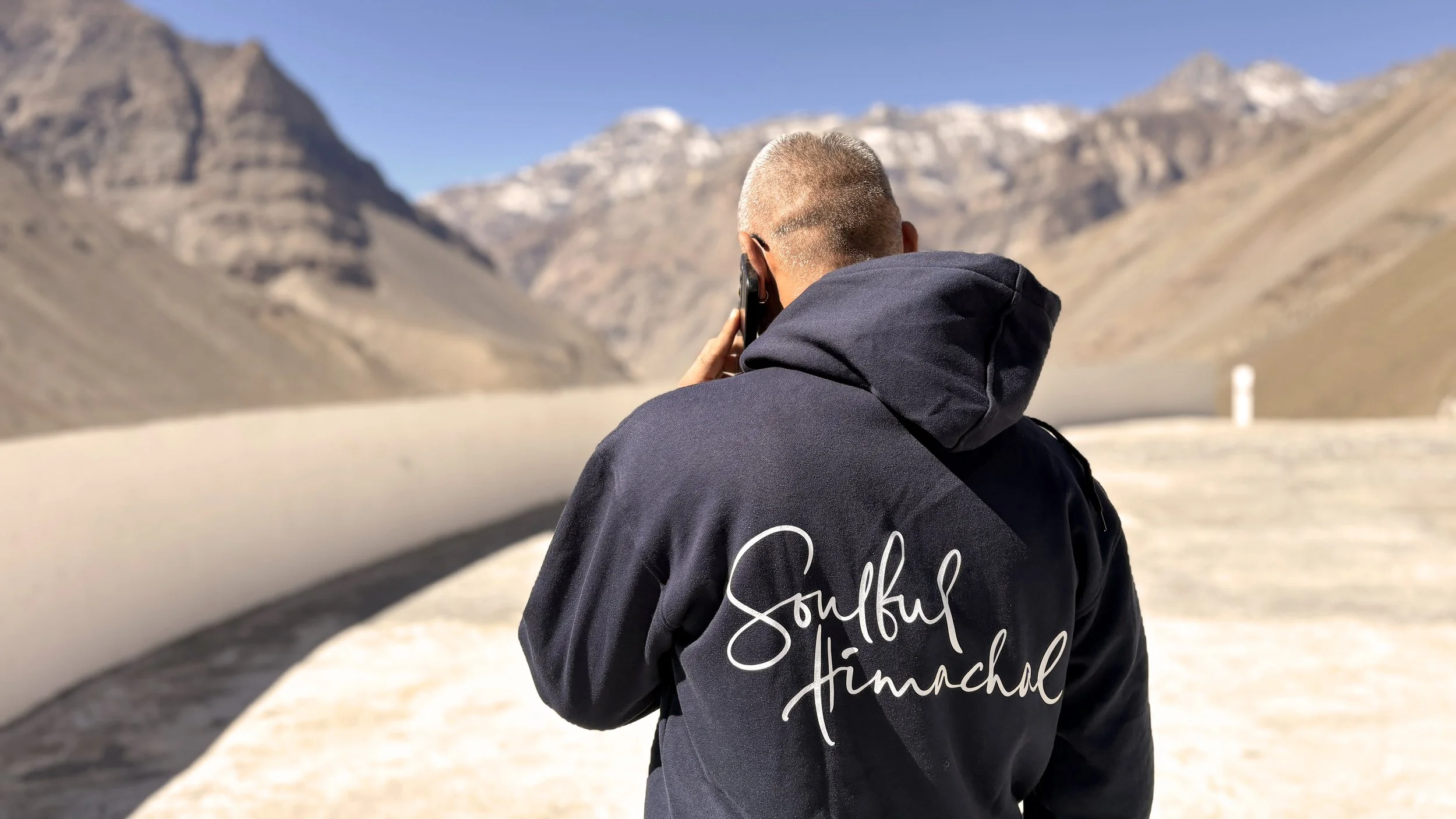
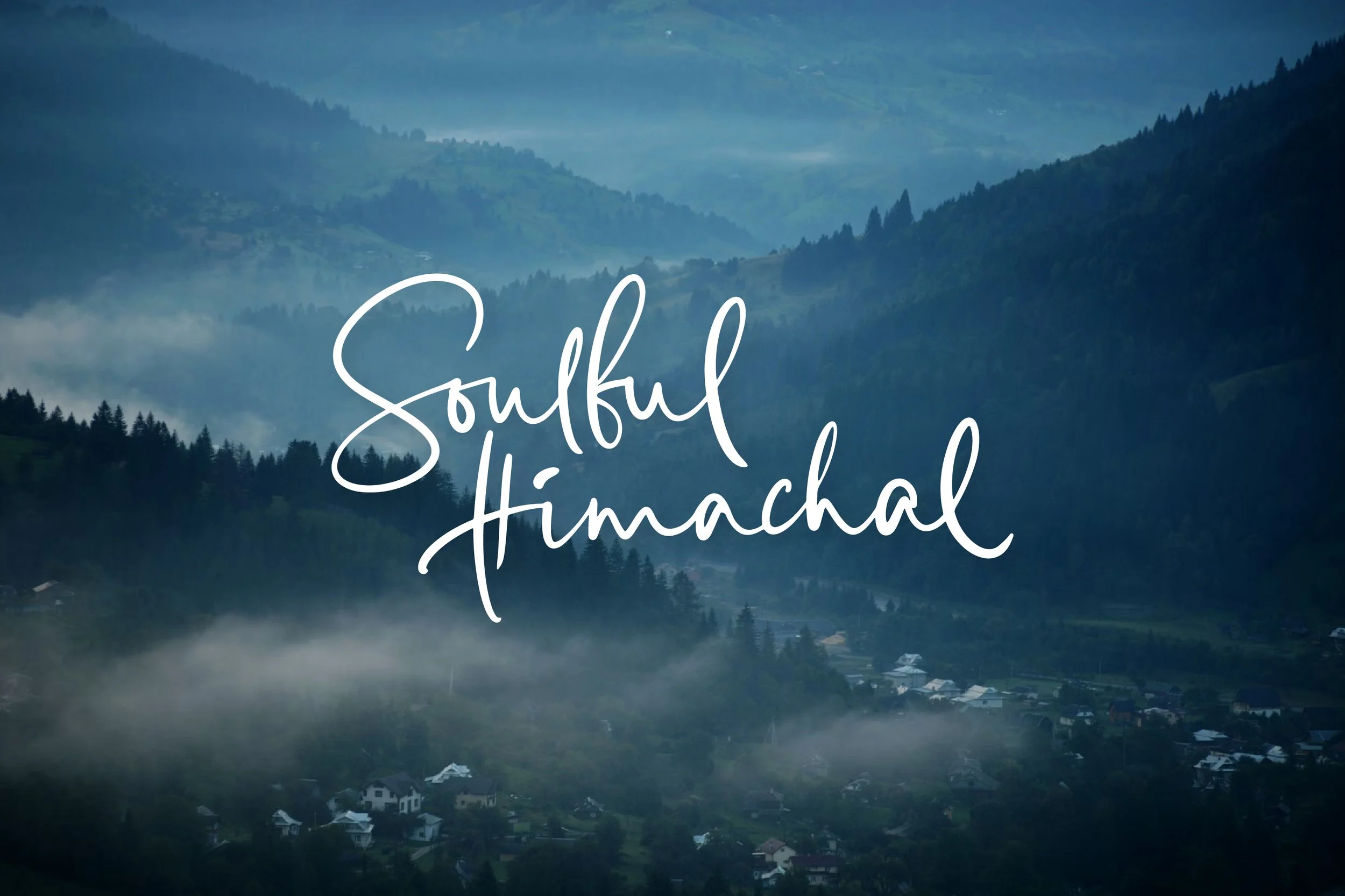
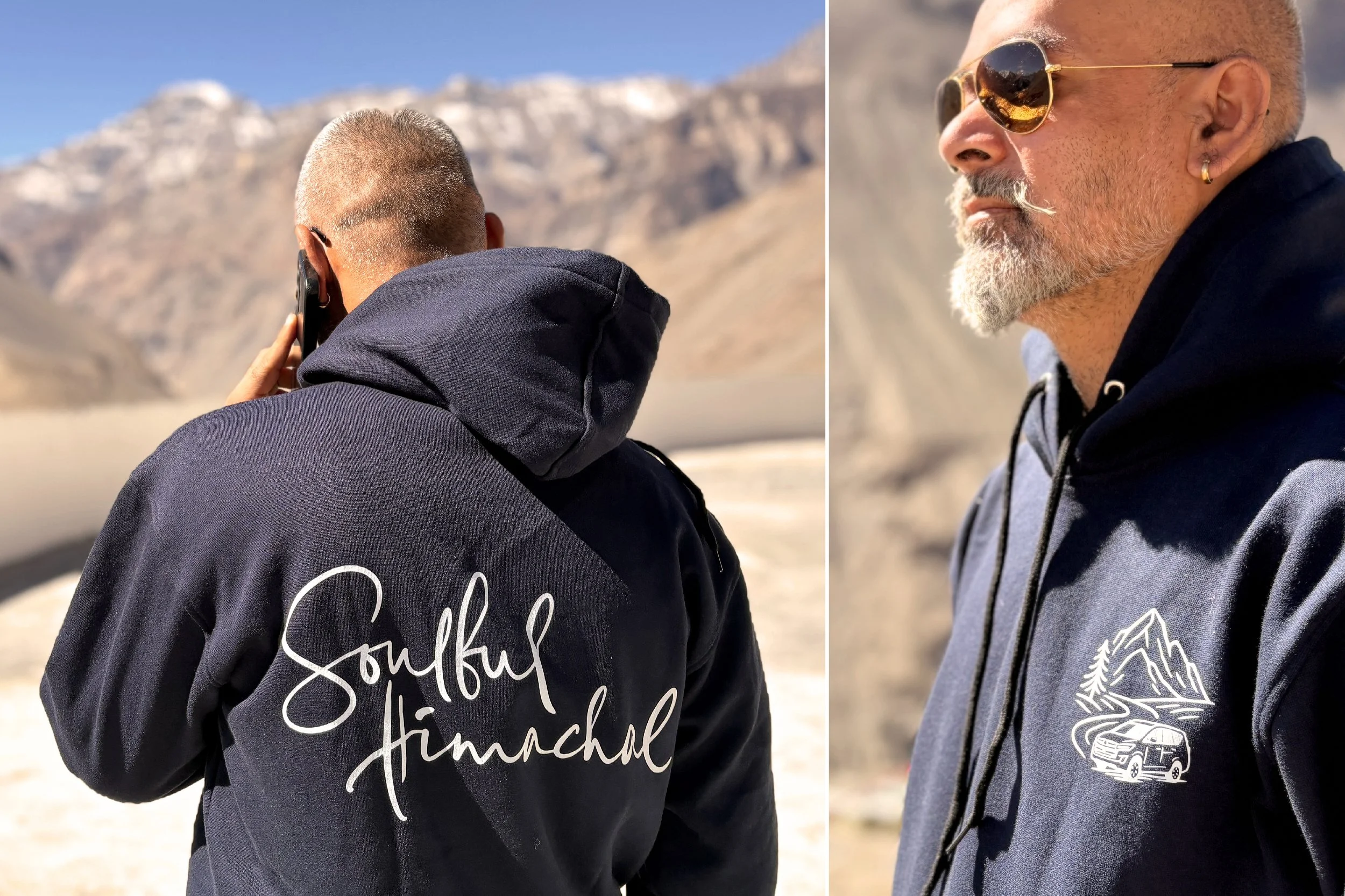
Soulful Himachal is a travel experience rooted in slow, meaningful journeys through the landscapes of Himachal Pradesh. The brand identity was created to capture the personal, warm and free-spirited character of travelling through the mountains, moving away from the conventional visual language of tourism.
The hand-drawn logotype brings an expressive and human quality to the identity, reflecting the spontaneity and individuality of each journey. Its fluid lettering is complemented by a simple illustrative visual language inspired by mountains, roads and exploration, creating an identity that feels personal, authentic and closely connected to the region.
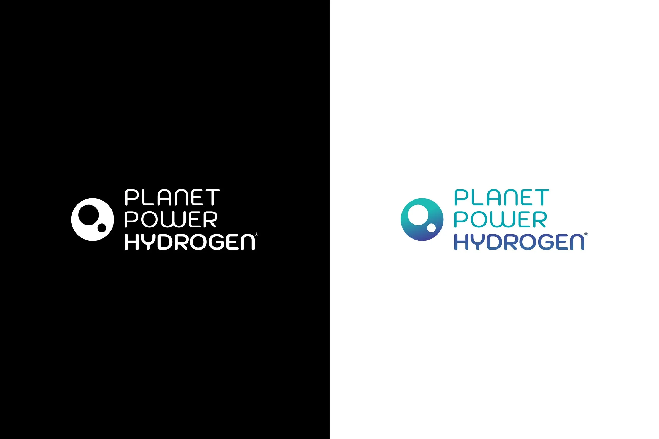
Planet Power Hydrogen
An innovative and unique activity in branding for a popular product of the company, was a part of ‘On Ground Activation’ during the legendary Kumbhmela 2012. It was quirky and memorable. A small question, ‘Lifebuoy Se Haath Dhoya Kya?’ in Devanagari Typography was created for Manual Electronic Roti Stamps. It not only promoted the importance of sanitisation but also subtly equated the Lifebuoy products with essential cleanliness and protection through thorough hygiene.
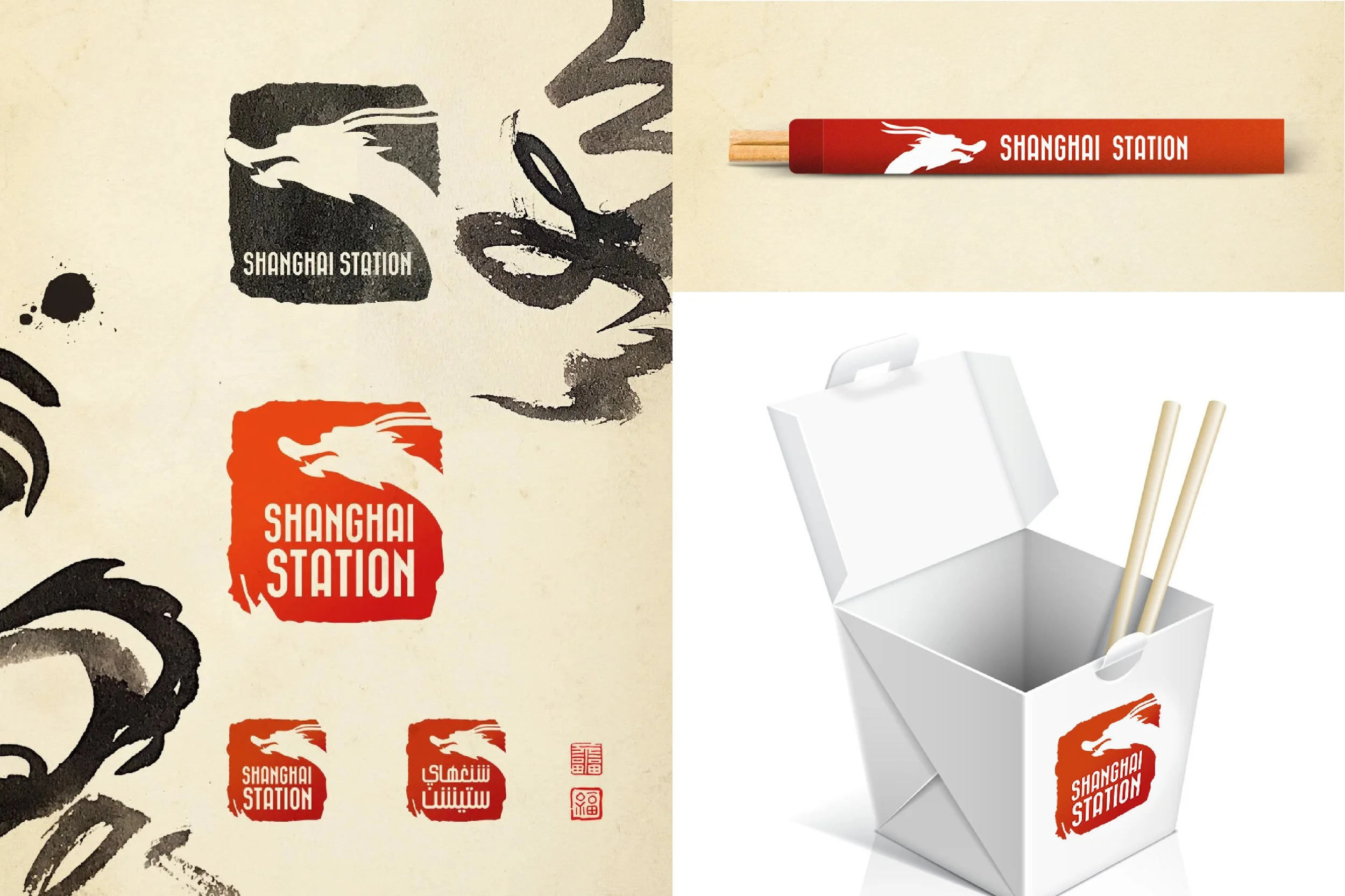
Shanghai Station
An innovative and unique activity in branding for a popular product of the company, was a part of ‘On Ground Activation’ during the legendary Kumbhmela 2012. It was quirky and memorable. A small question, ‘Lifebuoy Se Haath Dhoya Kya?’ in Devanagari Typography was created for Manual Electronic Roti Stamps. It not only promoted the importance of sanitisation but also subtly equated the Lifebuoy products with essential cleanliness and protection through thorough hygiene.
Story For Me
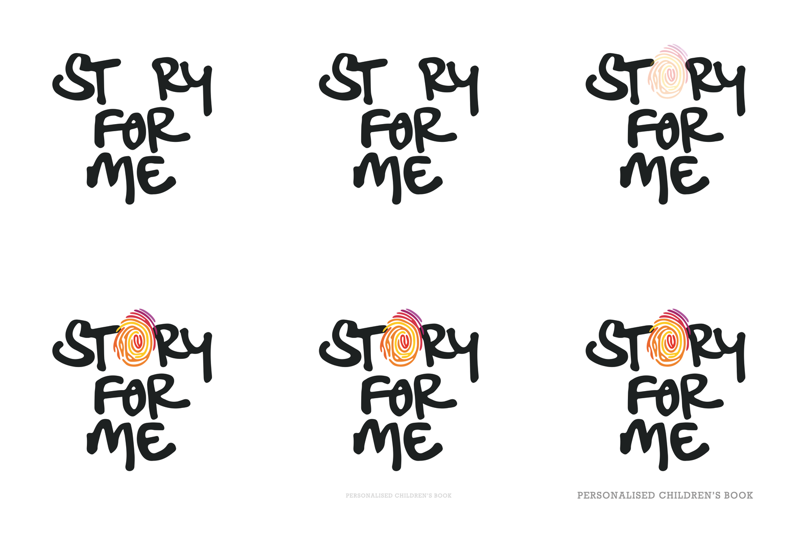
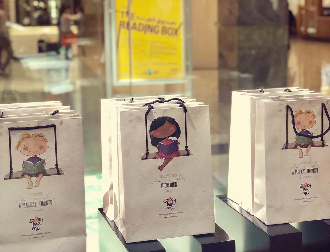
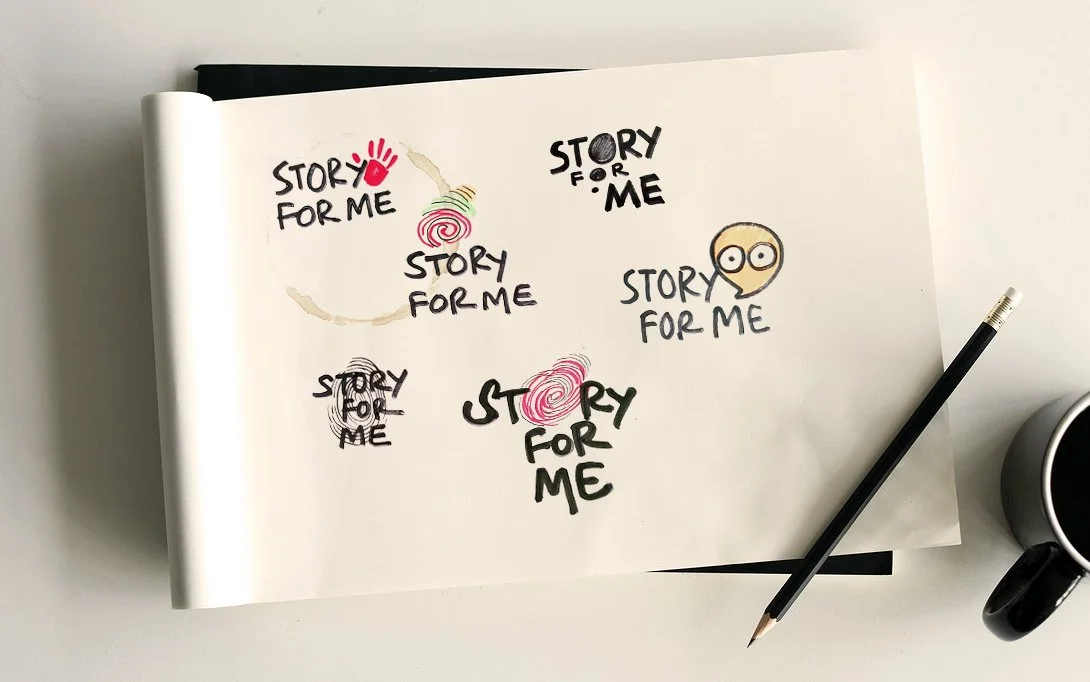
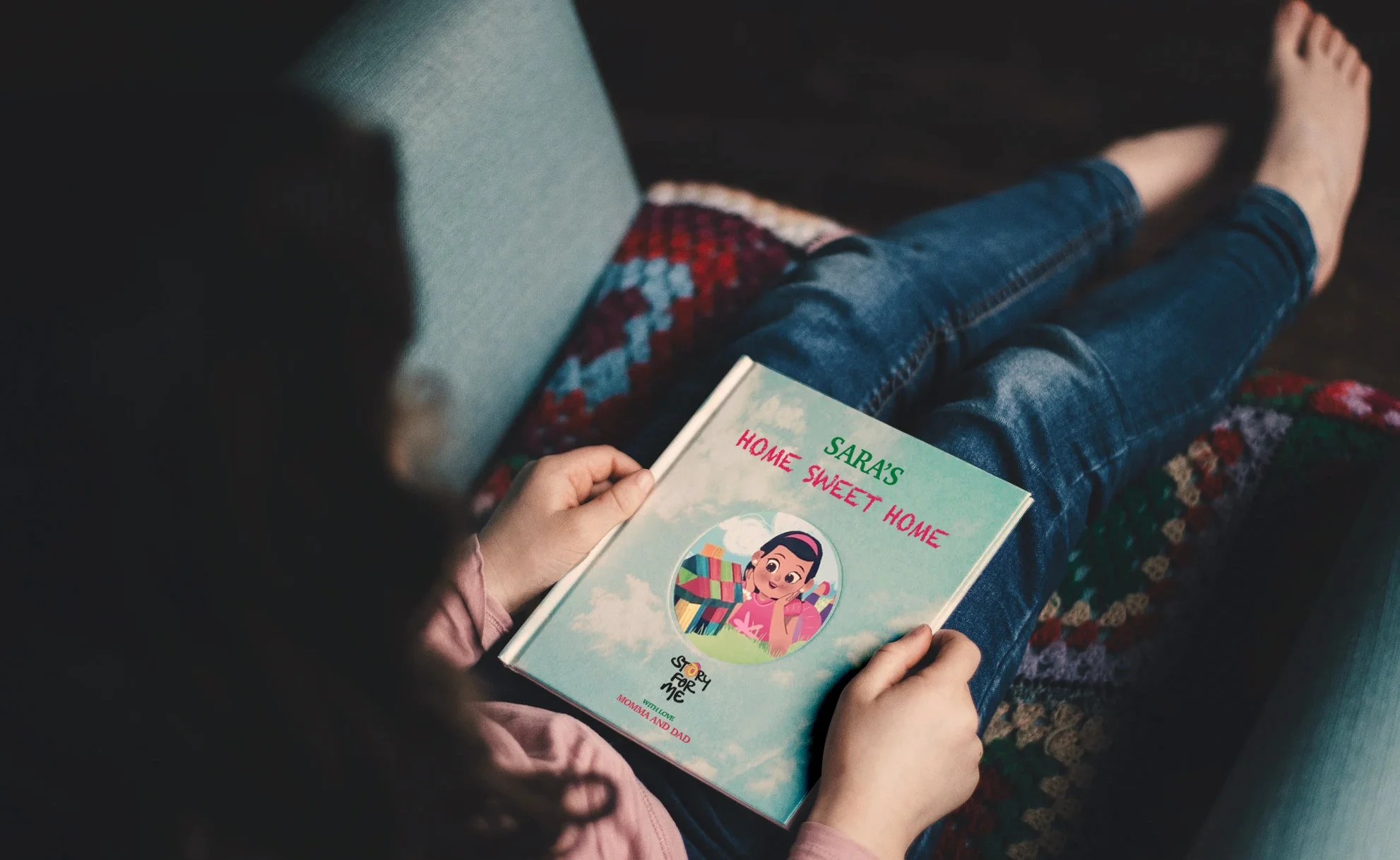
Story For Me creates personalised children’s books that place each child at the heart of their own story. The identity was inspired by the idea that every child is unique, represented through a colourful fingerprint integrated into a playful, hand-drawn wordmark. The result is a warm and expressive identity that celebrates individuality, imagination and the joy of becoming the hero of your own story.