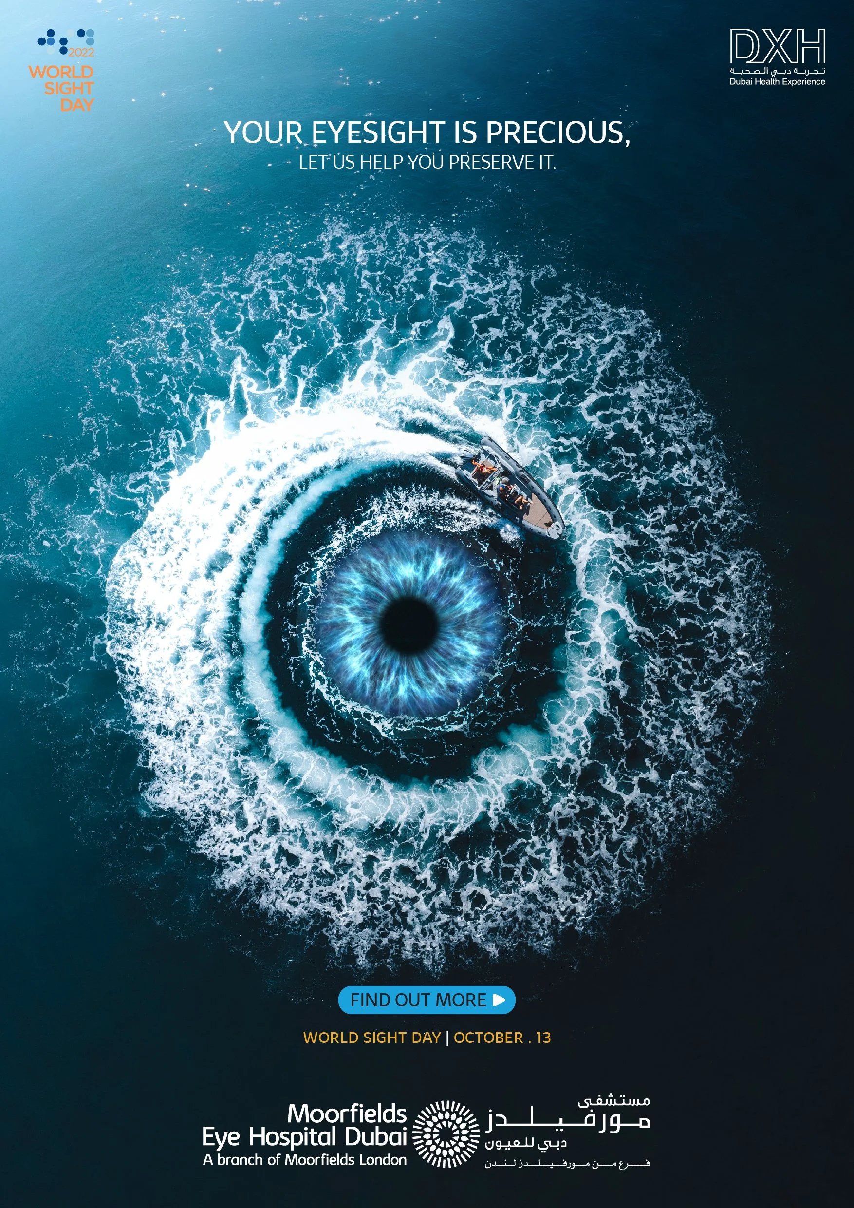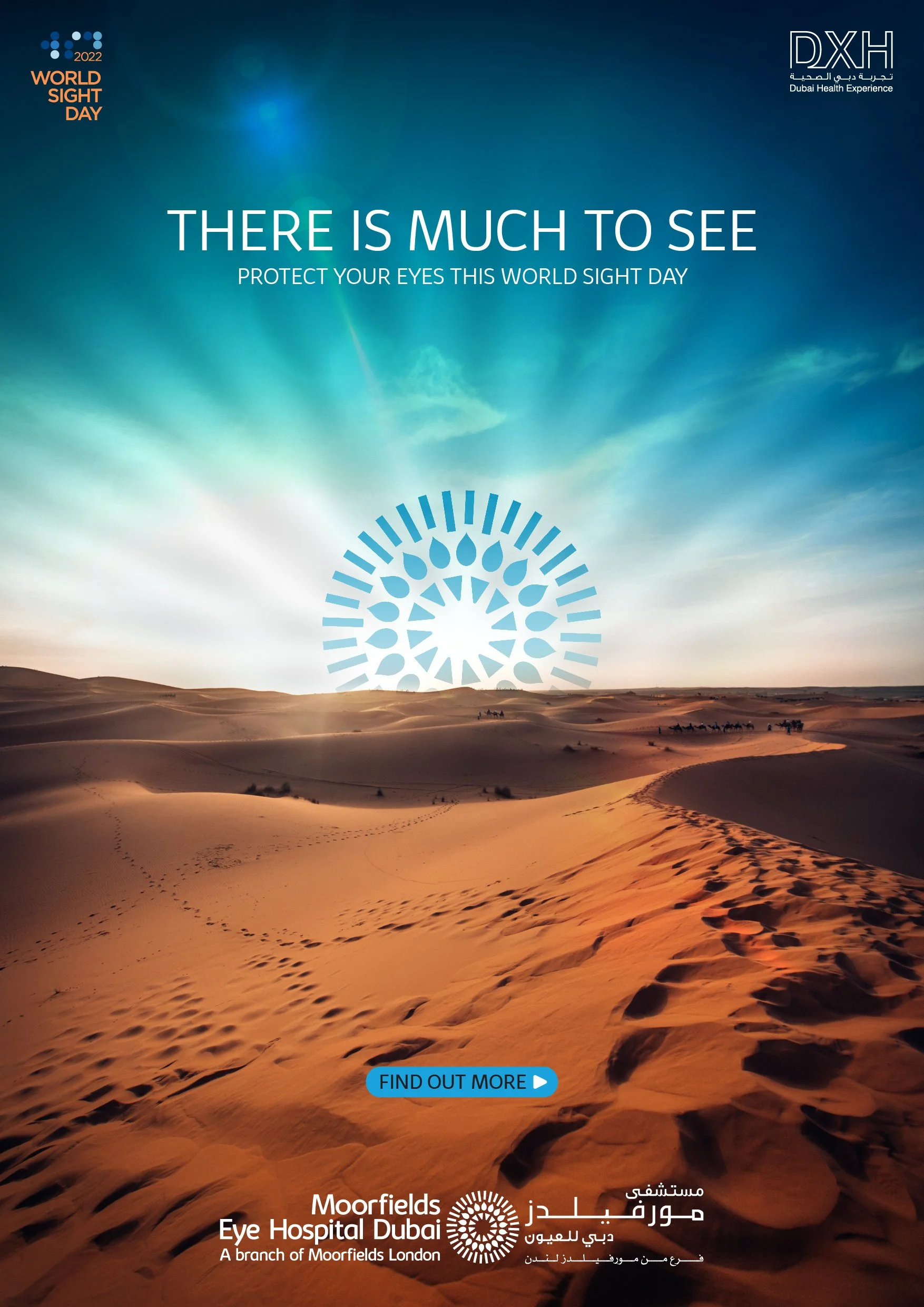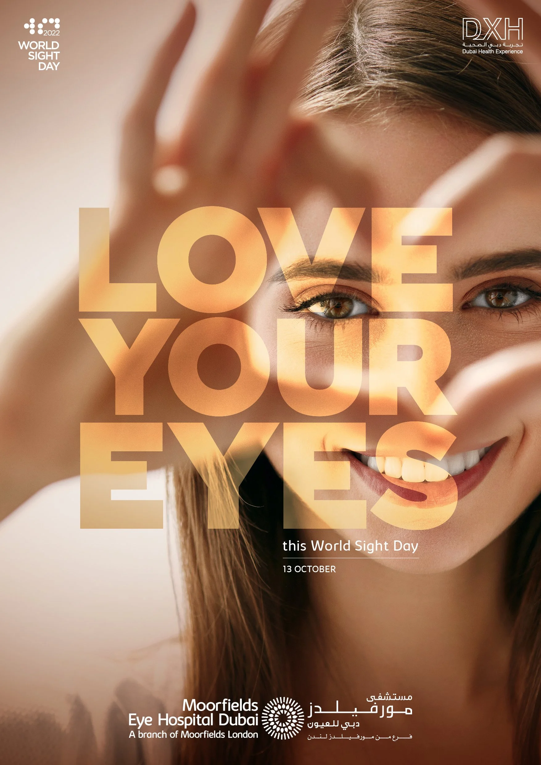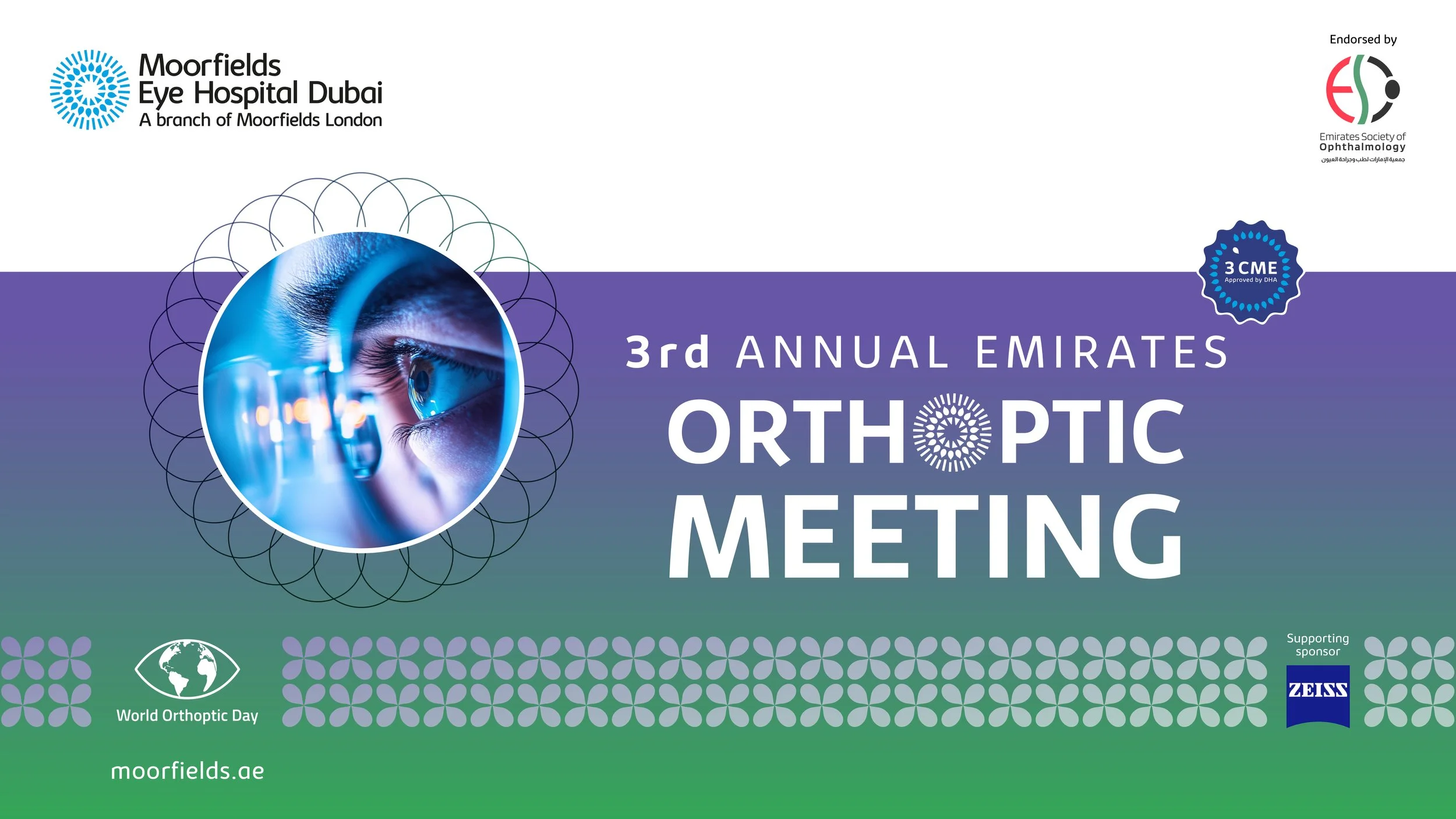
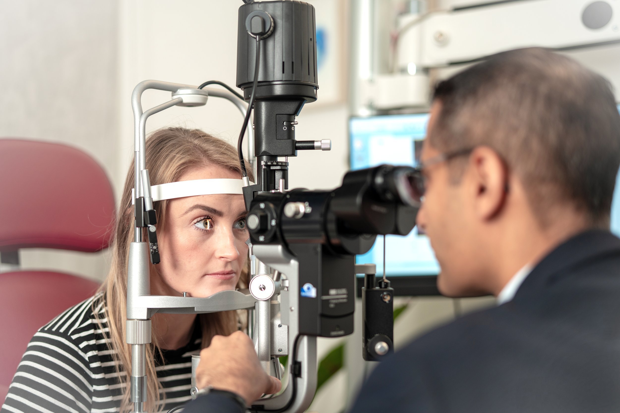
Moorfields Eye Hospital
The concept was creating a simple, modest yet an impressive design that echoes the core values of the brand- superior quality when it comes to flavour and sustainability regarding environmental responsibility. This led to the experiments with the shades of green and exploring a form that aligns with the product- coffee. A minimalistic approach was adhered to while arriving at the current calligraphic stroke that remains clean yet appealing with any application, across size and surface.

-
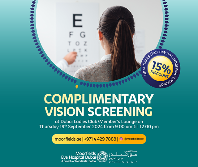
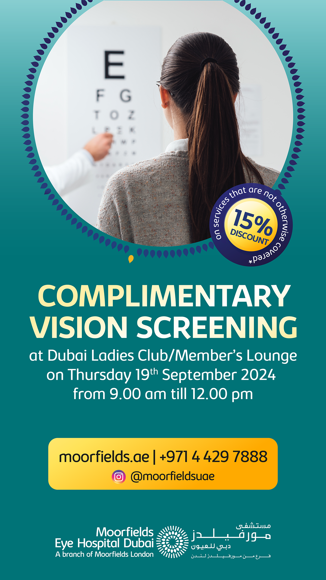
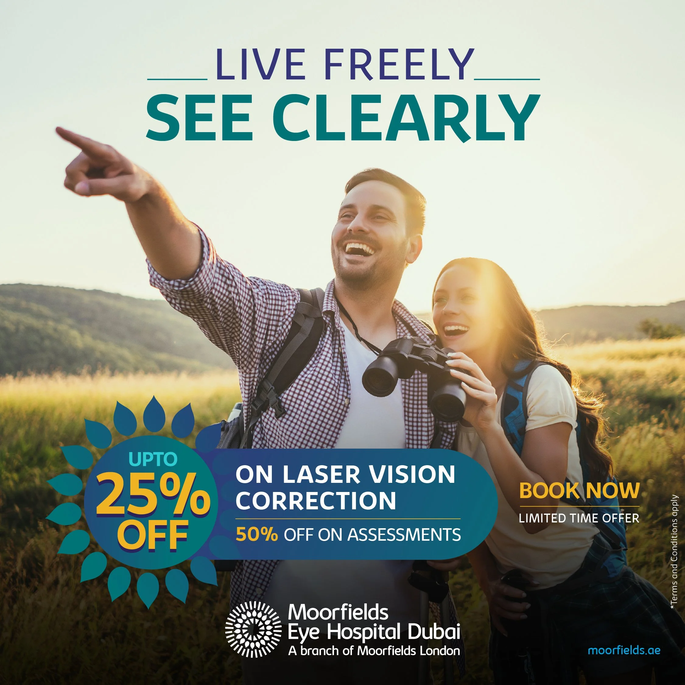
Promotional Campaigns
ATL and BTL Design Concepts
Social Media Design
In-house Graphic Concepts & Design -
Corporate Stationery System
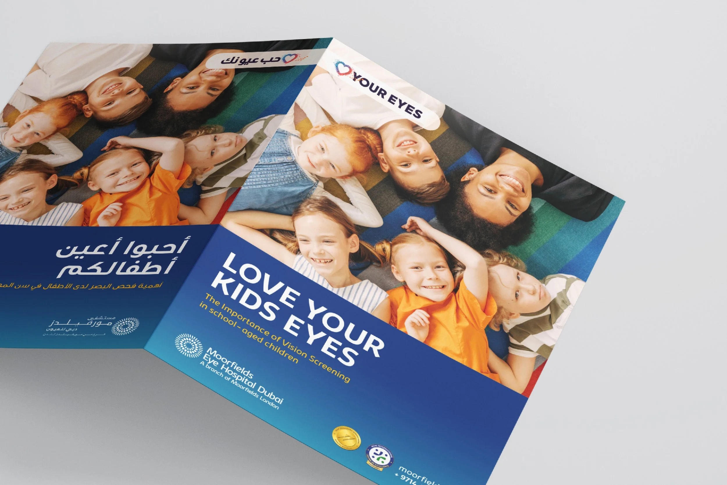
Company Collateral Templates
Marketing & Communication Layouts
Packaging & Labelling Direction
Digital & Social Media Visual Framework